Explore Together
Role: UX & UI Design
Project Duration: July-October 2024
Explore Together is a user-centered app that simplifies the process of finding experiences and activities for people with shared interests after relocating to a new area.
Problem & Background
After moving, adjusting to a new place brings challenges, difficulties and unknowns across various aspects.
People might cope with cultural and social challenges, economic and employment issues, healthcare and education access issues, and practical and logistical challenges after moving. Everyone who moves goes through an adjustment process, which can vary from person to person and depending on the specific changes involved.
Research Goal
The challenges, difficulties, and unknowns that individuals face when adjusting to a new place after moving are explored to identify strategies and resources that can support a smoother transition.
Research Methods
Interviews: I have completed four interviews, all with individuals who have relocated to a different country.
Survey: I have supported the interview results by conducting a survey.
Competitive Analysis: I have conducted SWOT analysis and examined Yelp, Meetup, Google Maps and Nextdoor.
Competitive Analysis
For this part of the project, I have conducted SWOT analysis and examined Yelp, Meetup, Google Maps and Nextdoor. I compared their key features to identify what problems they address and how they enhance user experiences. All the apps offer a reliable resource for users to explore their surroundings, with some also providing opportunities to connect with new people. By addressing identified pain points and leveraging opportunities for growth, the app has the potential to stand out in a competitive market.
User Interviews & Affinity Map
I conducted four remote interviews to understand the target users' needs and pain points, focusing on open-ended questions to encourage detailed responses and uncover deeper insights.
Affinity mapping helped me understand the users' needs by allowing me to organize and visually group feedback and insights, making patterns and key pain points more apparent, which in turn guided my design decisions effectively.
Interview Findings
The interviews led me to the following key conclusions:
The first few weeks or months are the hardest.
Having a social community is important.
Finding a new community and local places is difficult.
Adapting to cultural and geological differences is challenging.
People want to maintain habits and find suitable activity locations.
Familiarity with surroundings and attitudes makes adaptation easier.
Personas
Personas played a crucial role in guiding my design process by keeping me focused on the needs, goals, and challenges of my target users. I frequently referred to them to ensure that my design decisions were aligned with the users’ needs.
Sitemap
Creating the sitemap allowed me to visualize the product's structure and functionality, enabling me to effectively categorize its features and streamline user navigation.
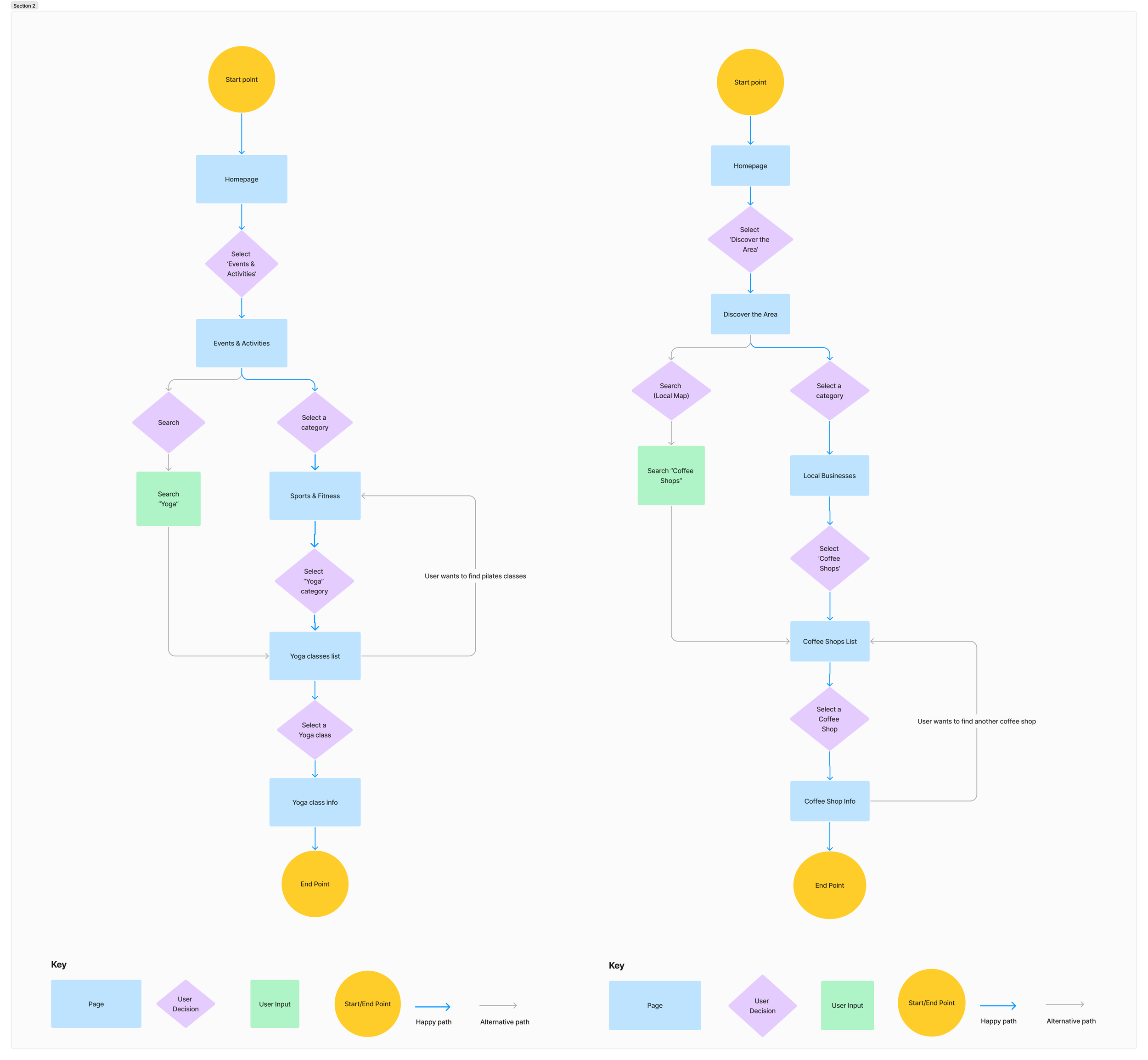
Task Flow & User Flow
Creating user flow helped me to visualize the overall structure of the screens and plan their layout accordingly.
I created two user flows:
Finding a yoga event
Finding a coffee shop
Task flow helped me outline the steps needed to achieve the goals set for the users, ensuring that each interaction is straightforward and efficient.
I created two task flows:
Finding a coffee shop
Finding a concert
Branding
My design is centered around the values of inclusivity, empowerment, simplicity, reliability and supportiveness.
My color selection conveys warmth and empowerment, as well as trust and reliability. I aim to provide clean typography, simple layouts, and friendly icons to create an engaging, confident, and user-friendly design
Low-Fidelity Wireframes
These wireframes focus on layout and functionality, allowing me to visualize the user flow and key features without the distraction of detailed design elements.
High-Fidelity Wireframes
In this phase, I crafted a detailed, visually engaging interface that captures the app’s final aesthetics and functionality. This stage integrates cohesive typography, color schemes, and interactive elements, providing a realistic view of the user experience and ensuring design consistency across all screens.
Usability Testing
I conducted a usability test with five participants, and based on their feedback, I created an effort-impact matrix to prioritize improvements.
Revisions
After usability test, along with minor adjustments, I focused on reorganizing the category structure to reduce confusion, updated the information on cards to enhance ease of use, replaced the logo with my second option that I had created.


